Osprey.
An identity for an invented coastal developer, designed around the care put into its buildings. A self-initiated project covering the brand, printed materials and digital concepts.
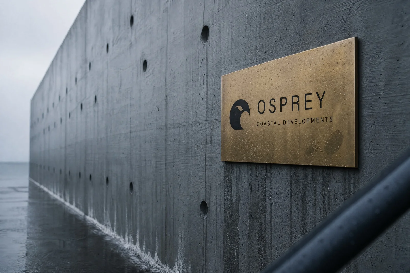
Osprey is an invented company. This self-initiated project shows our design approach; it was not commissioned and has no client or sales results.
Give buyers a reason to look beyond the view.
The brief imagined a coastal developer selling homes to people who intend to stay. The identity needed to reflect the quality of the buildings and their materials. That led to a restrained palette and a simple mark we could carry from a business card to signage.
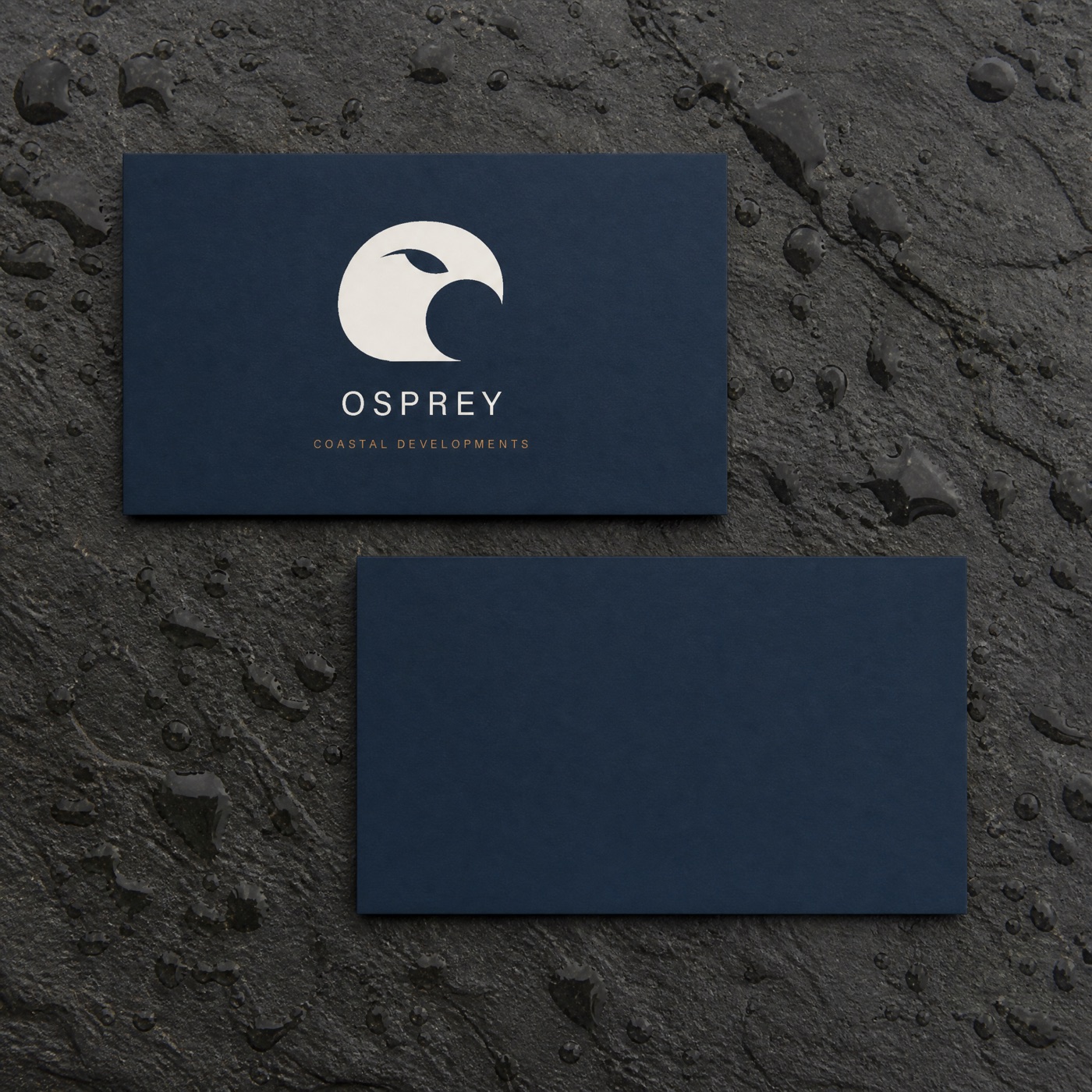
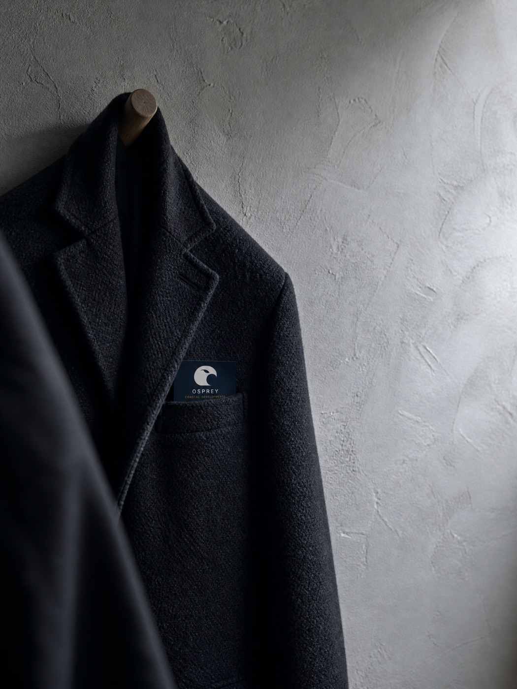
A simple mark, carried through the details.
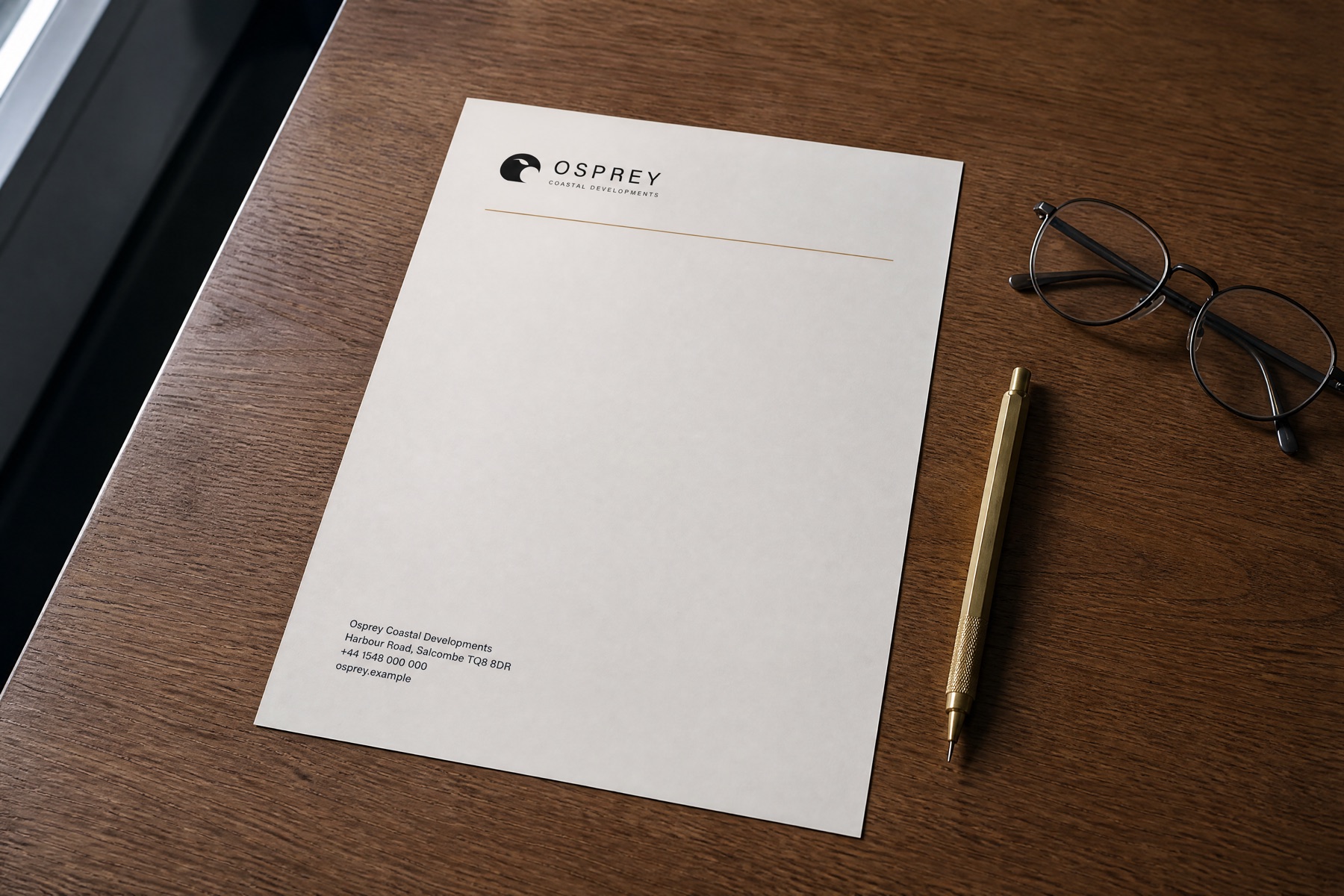
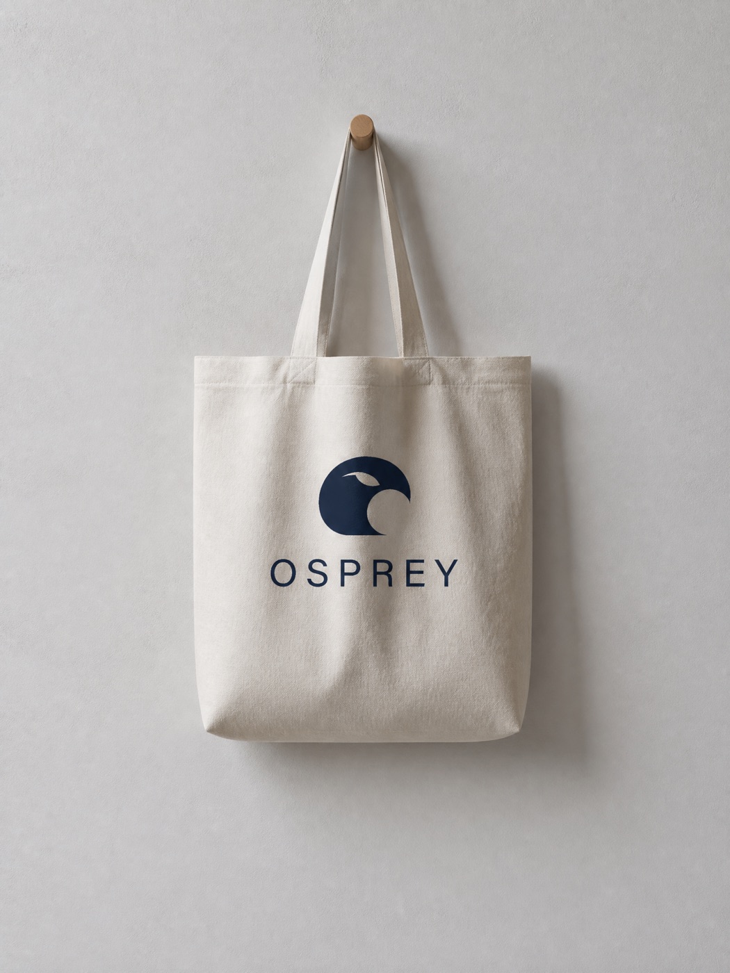
A single notch in a circle suggests an osprey's head. Acumin Pro gives the wordmark a precise, understated shape. We used the height of the lettering to set proportions and spacing, then adjusted text and border colours after contrast checks. Those choices carry through the stationery and guidelines shown below.
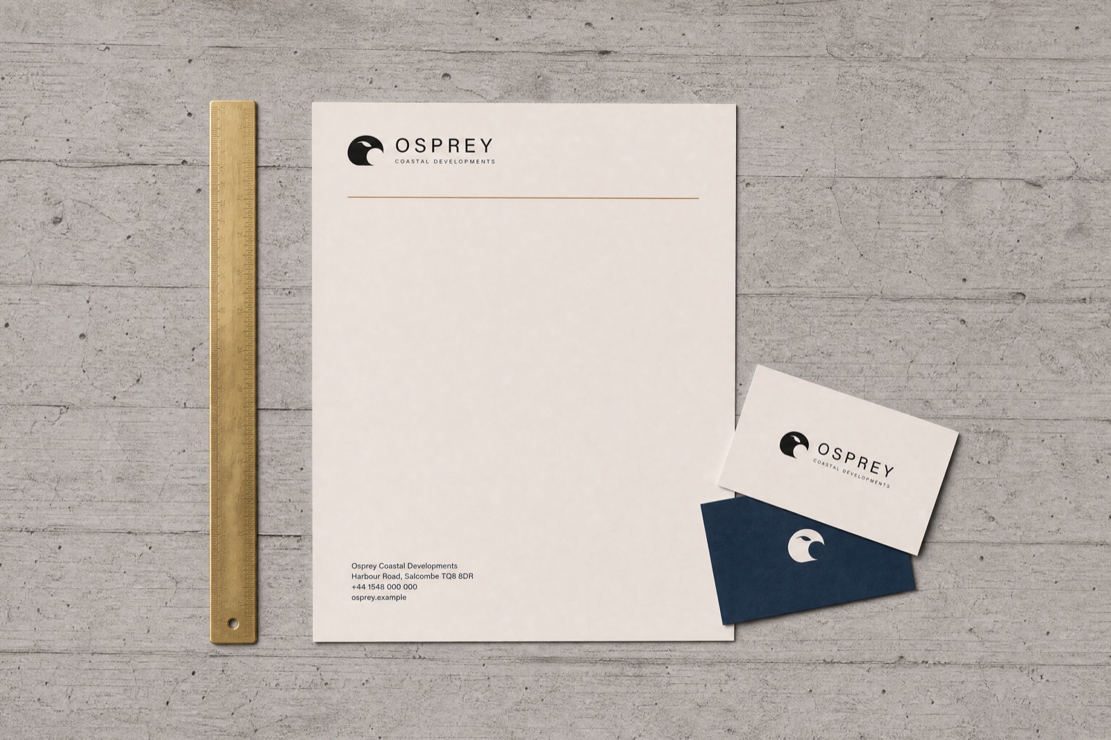
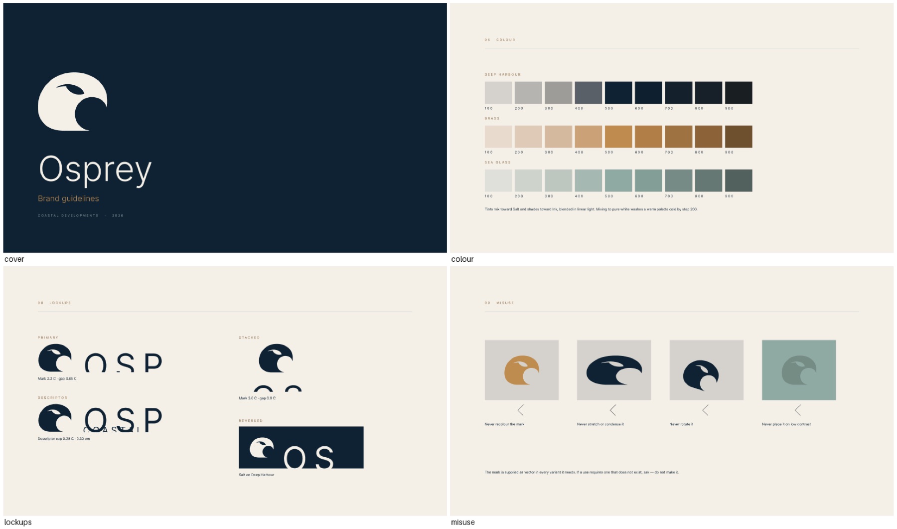
The same identity, from stationery to screen.
The website and app concepts test how the typography, palette and layout work on screen. Twelve icons take their shapes from building materials and coastal details, including concrete window reveals, oak and stone. The digital concepts share the same visual rules as the printed pieces, giving a team a starting point for future applications.

More work.
A rebrand film concept for Pastel and Instagram story design for Fly Dheera.